


By definition, the Internet is a global network of connected computers. But in practice, it takes on wholly new characteristics; it’s at once a revolution in communication and a commonplace utility. It’s an extension of our collective consciousness and a great way to waste hours looking at cats. It’s both a physical place – present in the forgotten infrastructure of data centers and subterranean cables – as well as an abstraction that seems to blow through our laptops and phones.
But what does it look like – and how do you map something so difficult to define? Historically, the cartographer’s job has been to chart the unknown in a way that gives others a chance to follow in their footsteps. But the role of contemporary Web cartographers isn’t to provide a how-to guide. Rather, it’s to map how these digital arenas have been explored and are in the process of being explored. This method necessitates a very different type of map.
There’s no right or wrong way to map the Internet. After all, it’s only around three decades old, and each decade has brought about a radically different way of seeing and using it. We’ve collected five examples of our favorite maps of the Internet. Each one gives a completely different look at the nature of the web – which is fitting, given that the experience of the web is different to each user, and the Internet itself is in a constant state of flux.
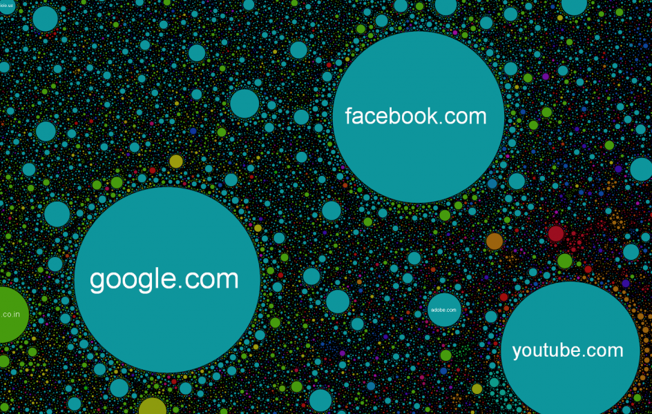
The Internet Map project was made by plotting the frequency a website is visited, while the colors of each circle represent different countries. According to its creator, Ruslan Enikeev, “Every site is a circle on the map, and its size is determined by website traffic, the larger the amount of traffic, the bigger the circle. Users’ switching between websites forms links, and the stronger the link, the closer the websites tend to arrange themselves to each other.”
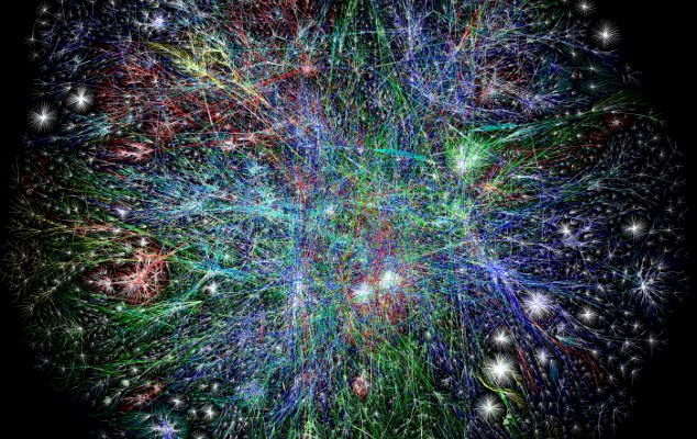
This map by Barrett Lyon is piece of a larger project called Opte – and it looks like a mass of neurons in the human brain. But the map, which is now part of MoMa’s permanent collection, was created using “a technology called ‘traceroute,’ which actually goes over every sequence of the Internet and creates a visual trace. It would be like driving each road in the world systematically and then drawing that out,” Lyon told MoMa. His code can map the entire Internet in one day. As he states on the project’s website, Opte has three purposes: to sense major disasters, chart Internet growth, and to serve as a standalone art piece.
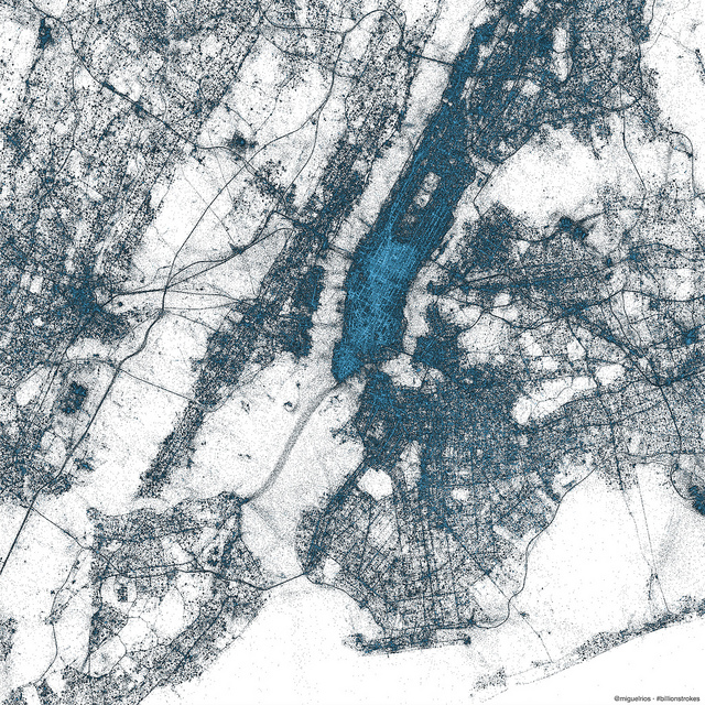
Created by Miguel Rios, the Visual Insights Manager at Twitter, these maps show how geo-tagged tweets mirror physical infrastructure. In the New York City example, the grid of Manhattan’s streets is clearly visible and in the map of Europe, ferry routes are illuminated.
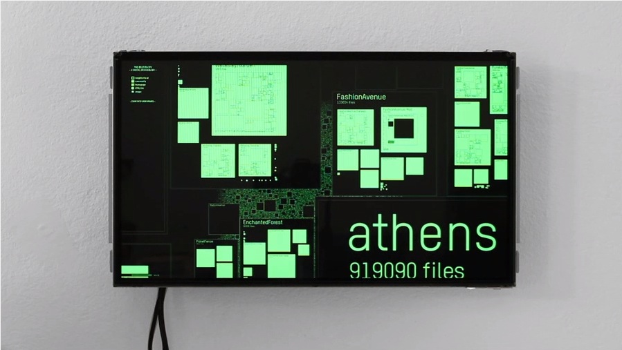
The dream of the 90’s is alive in The Deleted City, an interactive exhibit that preserves what’s left of Geocities. Geocities was the third most popular website when Yahoo purchased it in 1999 at the peak of the dot-com boom. But a decade later, as Facebook and MySpace lured traffic away, Yahoo demolished the digital city where 35 million “Netizens” had set up web pages organized around mutual interests. Before it disappeared completely, web archivists saved as much as they could and preserved it in a bit-torrent file. Using this data, designer Richard Vijgen created The Deleted City, which he calls a “digital Pompeii.” The video he made of the exhibit is complete with a Mini Disc version of Beck’s Loser, just to put you back in that 90’s headspace.
Data Drifting
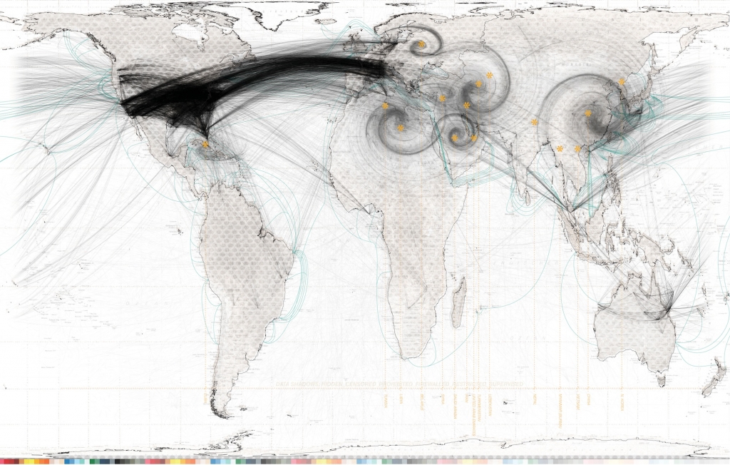
Formally trained in architecture but inspired by the data world, Brandon Pence created several maps of the Internet for his thesis project entitled “Data Drifting.” Data Drifting explores both the physical infrastructure of the Internet – like the subterranean cables and data centers – as well as the immaterial part of the Internet, such as the ways people interact in the digital space. The map above shows the subterranean cables that connect the World Wide Web to the world. The swirls represent “data shadows,” which are countries like North Korea where the flow of information on the Internet is restricted.
Top image: The Opte Project
